Now that we’re well into 2025, packaging design trends are taking shape, reflecting a blend of creativity, sustainability, and deep consumer engagement. Brands are reimagining their packaging not just as a container but as an experience—one that sparks joy, offers comfort, and pushes the boundaries of innovation.
In this blog post, we’ll explore the key trends in packaging design shaping the industry this year, highlighting how brands embrace these latest trends to stand out and connect with their audiences.
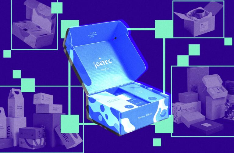
The 10 Trends Making Waves in Packaging Industry in 2025:
- Neo-Minimalism with Bold Contrast
- Biophilic Geometry
- Tactile Interaction
- Vibrant Maximalism
- Retro-Futurism
- Eco-Visibility
- Creative Cutouts
- Hand-drawn Aesthetics
- Playful Cartoon Mascots
- Chaos Packaging
1. Neo-Minimalism with Bold Contrast
Neo-Minimalism with bold contrast is a fresh evolution of the timeless minimalism trend—one that has cycled through art and design since the 1950s and remains a staple in consumer packaged goods.
This modern take strips away excess visual elements even further, embracing vast negative space, clean geometric shapes, and a few carefully chosen details. The result? A strikingly simple yet high-impact aesthetic that commands attention in an oversaturated market.
Brands embracing this trend present a bold, modern, and cutting-edge image, ensuring their packaging remains both visually compelling and effortlessly recognizable.
Examples
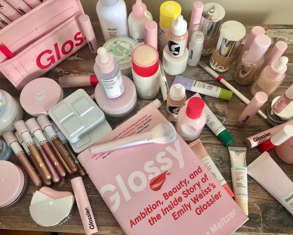
- Glossier maintains its signature millennial pink but adds a neon accent line to its skincare boxes for a fresh, eye-catching twist.
- Denada Sugar-Free Ice Cream uses bold, contrasting colors like blue, orange, pink, and mint, creating a striking yet minimalist look that ensures the brand stands out on the shelf.
Key Elements
- Limited Color Palette – Featuring just one or two bold hues for a striking yet refined look.
- Minimal Decorative Elements & Textures – Clean, uncluttered graphic designs with a focus on negative space.
- Simplified Typography – Bold sans-serif fonts that emphasize clarity and modernity.

2. Biophilic Geometry
Biophilic design comes from the term “biophilia,” which refers to humans’ innate connection to nature. This trend embraces organic shapes and patterns inspired by natural elements like vines, branches, and flowing water, bringing a sense of harmony and tranquility to packaging.
As more consumers navigate busy urban lifestyles, biophilic geometry serves as a subtle reminder of the great outdoors. Beyond aesthetics, it also signals a brand’s commitment to sustainability and environmental responsibility, making products more appealing to eco-conscious customers.
Examples
- Aware features delicate botanical illustrations on its folding carton packaging, reinforcing its identity as an organic cosmetics brand.
- Sprinkle tackles climate change awareness by reshaping its water bottles to resemble Arctic ice and melting glaciers.
Key Elements
- Organic Designs – Flowing, nature-inspired shapes that embrace natural imperfections.
- Botanical Patterns – Illustrations inspired by plants, flowers, and landscapes to reinforce eco-friendly messaging.
- Earthy Tones – Shades of green, brown, and muted blues that evoke a natural, sustainable feel.


3. Tactile Interaction
Luxury isn’t just about how something looks—it’s about how it feels. Tactile packaging enhances a product’s perceived value by incorporating textures that mimic premium materials like leather, wood grain, velvet, or silk. These textures instantly evoke a sense of quality and sophistication, making products feel more high-end. That’s why this packaging strategy is widely adopted by luxury goods like perfume, cosmetics, and wine.
Beyond aesthetics, textured packaging surfaces also invite consumers to touch and engage with the product, which studies show can lead to higher sales. Thanks to advanced decorative printing techniques, brands can now replicate luxury textures more easily, making high-end design more accessible.
Examples
- Wener Skincare differentiates each product bottle with a unique texture, celebrating individuality and personal expression.
- Perrier-Jouët incorporates debossed flower petal patterns on its eco-designed gift boxes, reinforcing its status as a premium champagne brand.
Key Elements
- Textured Finishes – Embossing, debossing, soft-touch coatings, or raised patterns create a premium, sensory experience.
- Material Imitation – Printing techniques that mimic high-end materials like leather, wood, or fabric add a luxurious feel without the cost.
- Multi-Sensory Engagement – Combining texture with metallic foils, matte/gloss contrasts, or scent-infused packaging enhances the unboxing experience.


4. Vibrant Maximalism
While minimalism has dominated packaging design in recent years, some brands are embracing the bold, expressive world of maximalism to stand out. This trend thrives on bright hues, intricate patterns, and daring contrasts, proving that when it comes to packaging design, more is more.
Maximalist packaging is particularly effective in industries like coffee and chocolate, where minimalist designs have become the norm. By going in the opposite direction, brands can break through the visual clutter and capture consumer attention instantly.
Beyond aesthetics, vibrant maximalist packaging also shows brand confidence and serves as a powerful expression of brand identity. Brands that take a stand—such as supporting the LGBTQ+ community—often use bold, colorful designs to reinforce their values. Meanwhile, the playful and energetic nature of maximalism makes products feel more fun and approachable, attracting consumers who might otherwise be intimidated by sleek, high-end minimalist packaging.
Examples
- Couplet Coffee embraces a playful and queer aesthetic, reflecting the founder’s identity as a first-generation immigrant, proud queer woman, and coffee lover.
- Maeve (formerly Seattle Chocolate) features whimsical illustrations on its chocolate packaging, celebrating its Pacific Northwestern roots, mythical namesake, and feminine energy.
Key Elements
- Bright and Vibrant Hues – Eye-catching color palettes that instantly capture attention.
- Excessive Illustrations & Intricate Details – Layered designs that provide a rich, dynamic visual experience.
- Fearless, Expressive Attitude – Packaging that reflects bold personality and strong brand values.


5. Retro-Futurism
Gen Z may be the most digitally native generation, but they have a strong fascination with nostalgia—gravitating toward trends like ‘90s fashion, vinyl records, and old-school cameras. The Retro-Futurism packaging design trend taps into this sentiment, blending vintage aesthetics with modern design elements to create something both familiar and forward-thinking.
This Gen Z packaging design trend fuses retro typography, pixel art, and psychedelic color schemes with sleek, futuristic details. The result? A “nostalgia meets imagination” style that resonates with Gen Z’s love for the past while keeping brands relevant in today’s digital world.
Beyond visual design, brands can enhance the unboxing experience by integrating cutting-edge technology—such as AR (augmented reality) interactions or gamified content—driving social media engagement and even making their products go viral.
Examples
- Coca-Cola’s limited edition “Zero Sugar Byte” features ‘90s gaming-inspired pixelated fonts on its soda cans while embracing a digital-first approach—launching in the metaverse and selling exclusively online.
- Goshen Coffee’s “Secret Stash” line showcases a mesmerizing, polychromatic box design reminiscent of a ‘70s disco ball, creating a futuristic yet nostalgic feel that makes consumers want to keep the packaging long after the product is gone.
Key Elements
- Vintage-Inspired Typography & Graphics – Retro fonts, pixel art, and psychedelic patterns blend past aesthetics with a modern twist.
- Futuristic Color Palettes & Effects – Neon hues, iridescent finishes, and holographic details create a balance between nostalgia and innovation.
- Tech-Enhanced Packaging – QR codes, AR interactions, and digital tie-ins (such as metaverse experiences) bridge the gap between the past and the future.


6. Eco-Visibility
Sustainability is no longer just a trend—it’s an industry standard. With Gen Z leading the charge as the sustainability generation, research shows they are more willing to spend on eco-friendly products and brands that align with their values.
However, simply using sustainable packaging materials isn’t enough. Brands must also make their eco-conscious efforts visible through packaging design. Traditionally, organic food and cosmetics brands have embraced earth-toned, nature-inspired packaging, but now industries across the board are following suit. By incorporating low-saturation hues like brown, green, and blue, as well as textured, uncoated, or rough finishes, brands can instantly signal their commitment to a more sustainable future while appealing to eco-conscious consumers.
Examples
- PaperBoy packages its wine in a molded paper outer shell that mimics a traditional wine bottle, with a lightweight plastic liner inside—reducing the carbon footprint associated with glass.
- Bscly ships clothing in 100% home-compostable sugarcane boxes, avoiding excessive plastic waste. Sugarcane is also more sustainable than paper, as it grows significantly faster than trees.
Key Elements
- Nature-Inspired Color Palettes – Earthy tones like brown, green, and soft blues reinforce a brand’s commitment to sustainability.
- Raw, Unfinished Textures – Uncoated, recycled, or rough-textured packaging enhances the natural, eco-friendly feel.
- Innovative Sustainable Materials – Compostable, biodegradable, and rapidly renewable materials (e.g., molded fiber, sugarcane, or mycelium-based packaging) reduce environmental impact.


7. Creative Cutouts
Transparent or see-through packaging has long been a trusted method for showcasing product quality and building consumer trust. However, brands are now elevating this concept with creative cutouts—adding playful, eye-catching shapes that not only reveal the product inside but also tell a visual story.
By strategically designing die-cut windows, brands can create smart packaging that is both functional and artistic. This trend often pairs with minimalist design, ensuring the focus remains on the cutout itself and the product within. The result? Packaging that invites interaction, sparks curiosity and stands out on the shelves.
Examples
- Good Hair Day Pasta uses a woman’s face as part of the packaging design, with uniquely shaped cutouts for each pasta type—turning the different pasta varieties into stylish hairstyles.
- Beejoya Silk Pillowcase features a crescent moon-shaped cutout on its box, symbolizing relaxation and reinforcing the brand’s promise of a restful night’s sleep.
Key Elements
- Die-Cut Windows – Strategic, playful cutouts that reveal the product and enhance its visual appeal.
- Minimalist Design – A clean, uncluttered layout that keeps the spotlight on the cutout and product.
- Storytelling Through Shape – Clever cutout designs that align with the product’s theme, creating a memorable and engaging experience.


8. Hand-drawn Aesthetics
In a world dominated by sophisticated, AI-generated designs, some brands are embracing imperfection to stand out. The hand-drawn aesthetics packaging design trend swaps flawless, digital precision for a raw, unpolished look, featuring scribbled illustrations, handwritten fonts, and sketch-like elements.
This approach adds a human touch, making products feel warmer, more authentic, and deeply personal. In an era where consumers crave genuineness and emotional connection, hand-drawn packaging helps brands tell a story that feels organic, expressive, and full of character.
Examples
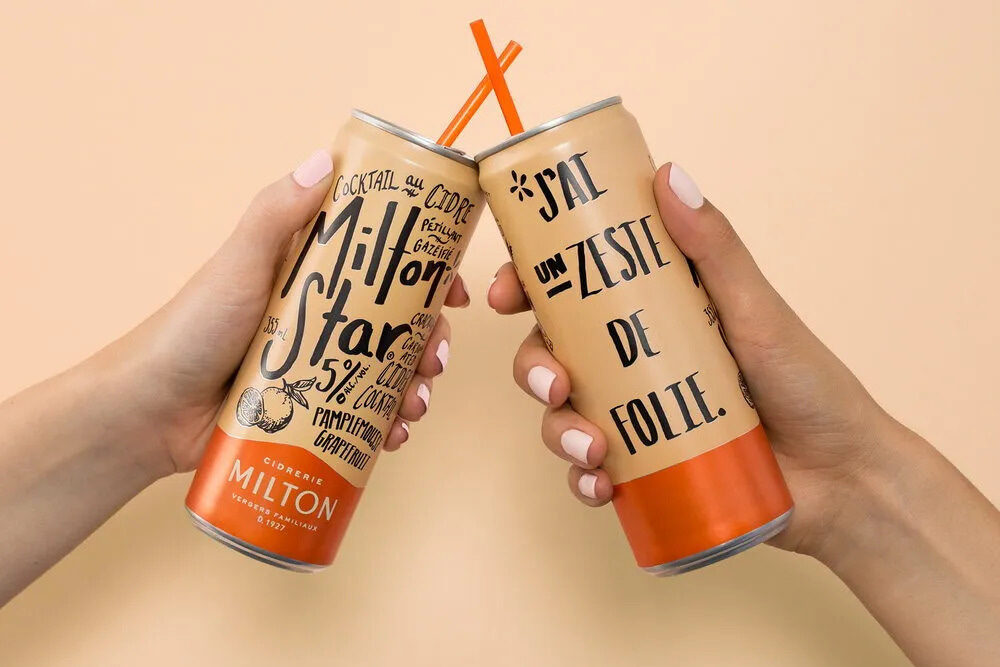
- Milton Star Cider incorporates playful, manuscript-style typography and doodle-like illustrations, giving the brand a youthful, refreshing, and humanized feel.
- Oatly embraces hand-drawn illustrations and lively, handwritten slogans on its oat milk cartons—reflecting the brand’s bold and rebellious personality.
Key Elements
- Handwritten Typography – Fonts that mimic natural handwriting, from neat cursive to casual scribbles, adding a personal and informal touch.
- Sketch-Like Illustrations – Doodles, rough lines, or chalk-style drawings that feel raw and expressive.
- Authentic, Handmade Vibes – A deliberately imperfect look that conveys creativity, warmth, and human connection.

9. Playful Cartoon Mascots
Cartoon mascots are making a comeback, injecting personality, humor, and nostalgia into packaging design. Whether quirky, adorable or downright goofy, these mascots create lighthearted and memorable brand identities that stand out in a crowded retail space.
While cartoon-style branding naturally appeals to younger audiences, it also taps into millennial nostalgia, reminding them of the animated characters they grew up watching after school. Beyond aesthetics, mascots help humanize a brand, weaving a narrative around the character that strengthens emotional connections with consumers.
Examples
- Bored Cow Animal-Free Dairy Milk features a cartoon cow mascot that reflects the brand’s playful, rebellious personality. Their website even includes comic strips and an interactive page for users to design their personalized cows.
- Garage Project’s “Coffee Vs. Tea” Beverage brings a cheerful rivalry to life with quirky illustrated coffee cup and teapot mascots, creating an upbeat and fun brand experience.
Key Elements
- Bold and Expressive Mascots – Playful characters that make the brand more relatable and engaging.
- Nostalgic or Whimsical Touches – Designs that evoke childhood cartoons or retro branding styles.
- Strong Storytelling Potential – Mascots with distinct personalities that help reinforce brand identity and messaging.


10. Chaos Packaging
The Chaos Packaging design trend is shaking up traditional branding, using unexpected, unconventional, and even bizarre designs to grab attention. Think tampons sold in ice cream tubs or perfume bottled like glass cleaner—these disruptive packaging choices are designed to shock, amuse, and spark conversations on social media.
But why are brands embracing chaos? In a world where consumers scroll past hundreds of products every minute, traditional and predictable packaging often gets overlooked. Chaos packaging disrupts expectations, creating cognitive dissonance by relating the unrelated—forcing people to stop, stare, and engage. This viral potential makes it a powerful marketing tool in the age of short attention spans and social media buzz.
Examples
- Vacation cleverly packages its sunscreen mousse in whipped-cream cans, sparking viral TikTok trends and challenging conventional skincare packaging.
- Fishwife’s Valentine’s Day Special playfully blurs the line between packaging and product, selling sardine-shaped chocolates in their signature canned fish tins—a surprising twist that delighted fans.
Key Elements
- Unexpected Packaging Formats – Everyday products packaged in unusual or mismatched containers.
- Playful Misdirection – Designs that make consumers do a double-take and spark curiosity.
- Viral & Shareable Appeal – Bold, unconventional packaging that drives engagement on social media.


Final Thoughts
The packaging landscape in 2025 is all about bold creativity, sensory experiences, and deeper brand connections. Whether it’s the striking simplicity of Neo-Minimalism, the playful charm of Cartoon Mascots, or the viral shock factor of Chaos Packaging, these top packaging design trends reflect changing consumer preferences and the evolving role of packaging in brand storytelling.
As competition grows fiercer and digital engagement becomes more crucial, brands that embrace innovative, eye-catching, and meaningful custom packaging designs will have the upper hand. Whether you’re looking to stand out on store shelves, go viral online, or align with eco-conscious values, there’s a trend here for you.
Which packaging design will you experiment with next?